UX Design
About The Rax App…
Rax Outdoor Company is an outdoor-focused channel and social media platform that I founded in 2022. My vision for the brand goes beyond just sharing outdoor content; I wanted to create a comprehensive experience for outdoors enthusiasts. In addition to curating engaging content, I began designing a line of apparel and am currently developing an app that will provide outdoor enthusiasts with all the essential tools they need in the field. While the app is still in development, you can explore the in-progress prototype by clicking on the link at the bottom of the section!
Product Concept
The Rax app will have every tool that the outdoorsman needs out in the field while hunting. The tools will consist of the following: rack scoring, property information, hunting seasons for all 50 states, and weather conditions for the week. As well as pages for apparel/accessories, about us, and a profile page.
What impact it will have
The Rax app will make it more efficient for the user to access every tool that is needed to prepare for a hunt and execute the actual hunt itself, without having to go to multiple different apps to gather each piece of information.
How it’s different from competitors
Compared to popular hunting apps like OnX and HuntStand, the Rax app will set itself apart from them with a rack scoring feature, hunting season info, and access to a diverse range of apparel and accessories.
Target audience
The target audience for the Rax app consists of hunters, hikers, or any outdoorsman that wants to purchase outdoor clothing, check property info, or simply wants to check the weather.
Key features
-The Rax app will have a rack scoring feature that allows the user to plug in the measurements for each of the tines, automatically adding all of the measurements up. Once the user is finished entering all of the measurements, they click “Enter Trophy” and it brings them to their Trophy Room where the measurement will be saved for future memories. On the “trophy room” page, the user can name the entered buck, as well as add an image of it.
-Another key feature that the Rax app will have is property info. With this feature the user will be able to slide around the map with their finger to find the parcel that they’re looking for, then tap the parcel, which will display the coordinates, owner, address, and number of acres.
In-Class Mobile Site Prototype
For this project my team created a business concept for another team to develop a website for. In addition to playing the role of the client, we were also responsible for developing the wireframes and prototype for their business. The client we designed for was "Choose Your Bloom", a flower farm where visitors can clip and arrange their own bouquets to take home. My role on the team was to design and develop the Home Page, Admission, Events, and Mission Statement page. In addition to that, I was responsible for developing all the animations. While the app is still a work in progress, this class project gave us the opportunity to expand our experience with Figma.
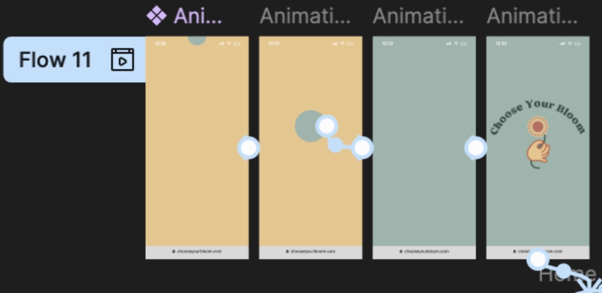
Developing Intro Animation
My Approach
Step 1: Identify the existing problems in the design and user flow.
Step 2: Research the business goals then do content inventory and site mapping.
Step 3: Sketch out low-fidelity wireframes to visualize layout and functionality of pages.
Step 4: Establish a design system to ensure consistency, then put together a high fidelity mock-up based off the low-fidelity sketches.
Step 5: Randomly select various people to do user testing and record their experience.
Step 6: Evaluate the feedback given and adjust accordingly.
The King’s Closet is a charity that provides free clothing to individuals in need. In our class, we had the opportunity to redesign their website and present our proposals, explaining the rationale behind our design choices.
Redesign of The King’s Closet Landing Page
Before…
Problems:
Logo has too much going on
Slogan cut off on landing screen
Not much color used
Very minimal design overall
After…
Solutions:
Created a more simplistic logo
Made slogan it’s own information bar
Developed new color system that engages the eye more
Displayed same minimal information in a way that interests the viewer
This is a nonprofit group with a mission to better the community. Our process involved researching the nonprofit’s mission and goals, then creating a design that would effectively communicate their message while being easy to navigate.
Redesign of Rusk County Community Foundation
Before…
Problems:
Illegible content on landing page
Outdated design trends
Navigation not clear
Icons don’t look clickable
Body text is hard to read
Page is too long
After…
Solutions:
Added drop shadow to logo
Changed color of “Donate” button to have more contrast
Included all menu items in the sub-header so hamburger button isn’t needed
Made the shape of the icon buttons round instead of six large blocks
Changed the layout of the icon buttons to be smaller and side-by-side, reduced thickness of the header


