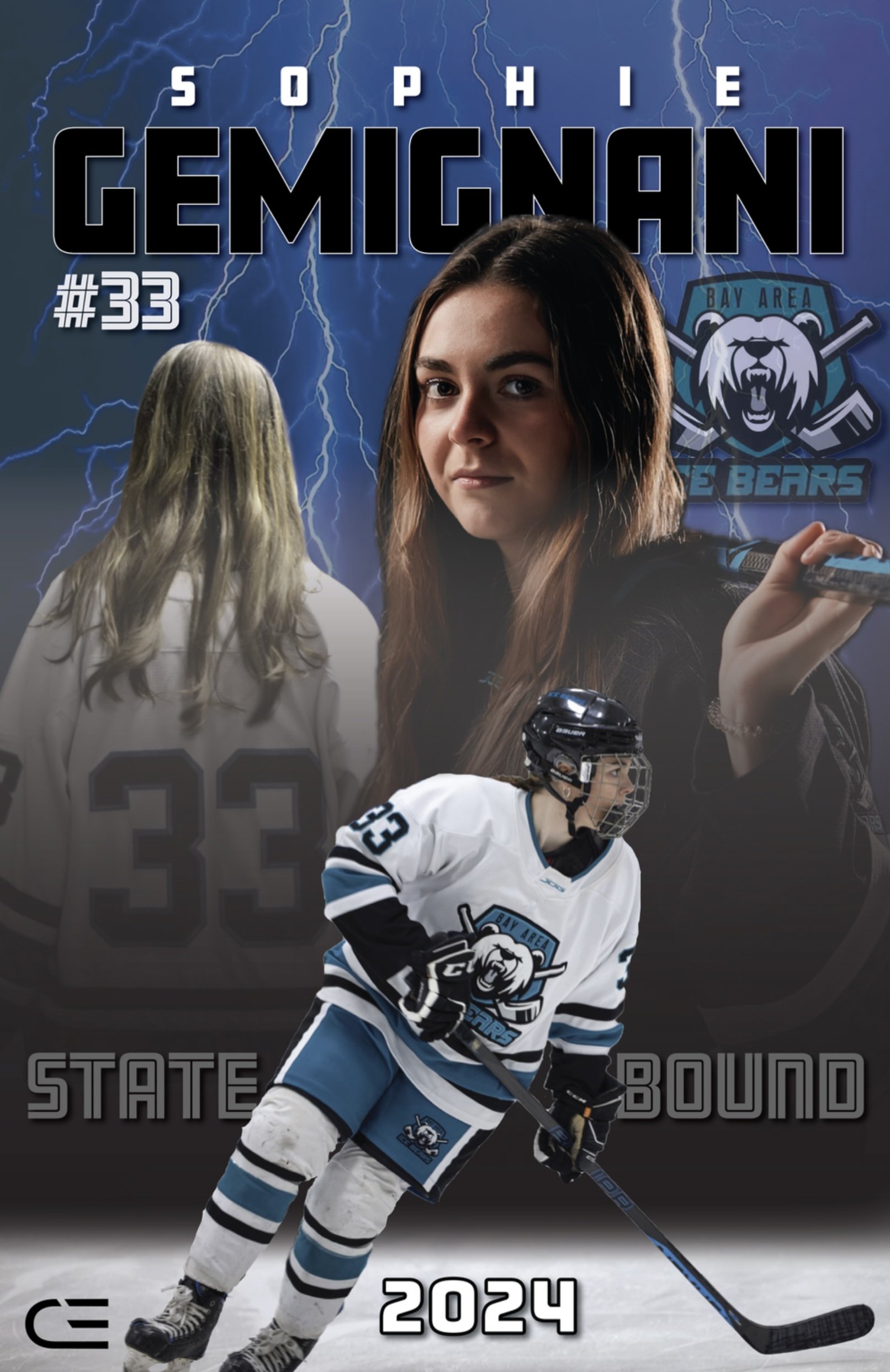
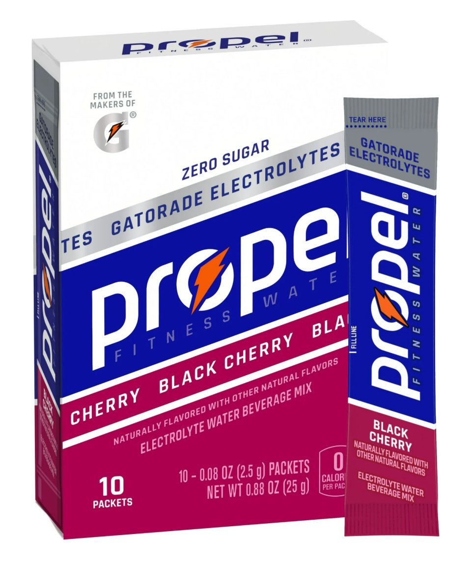
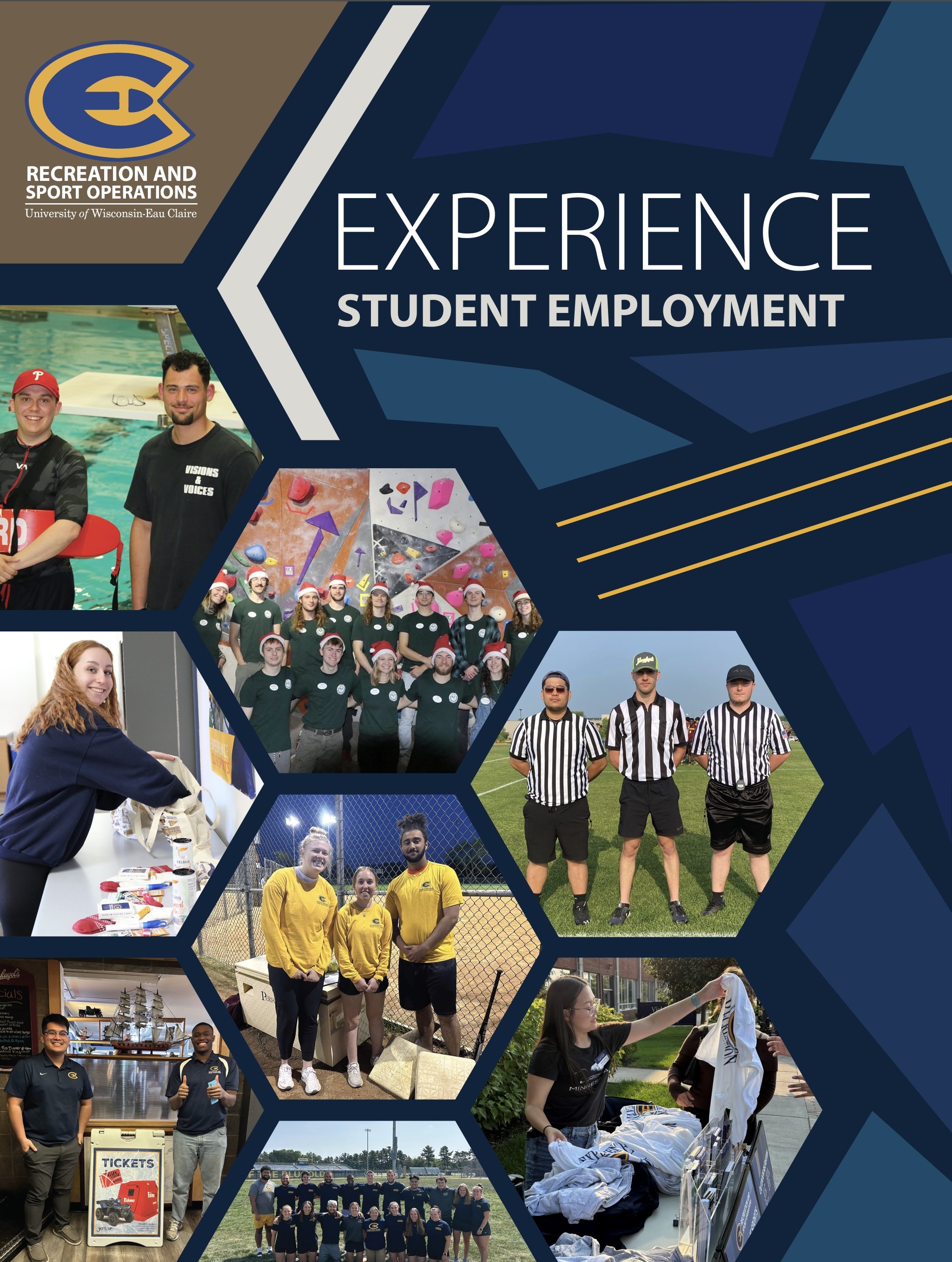
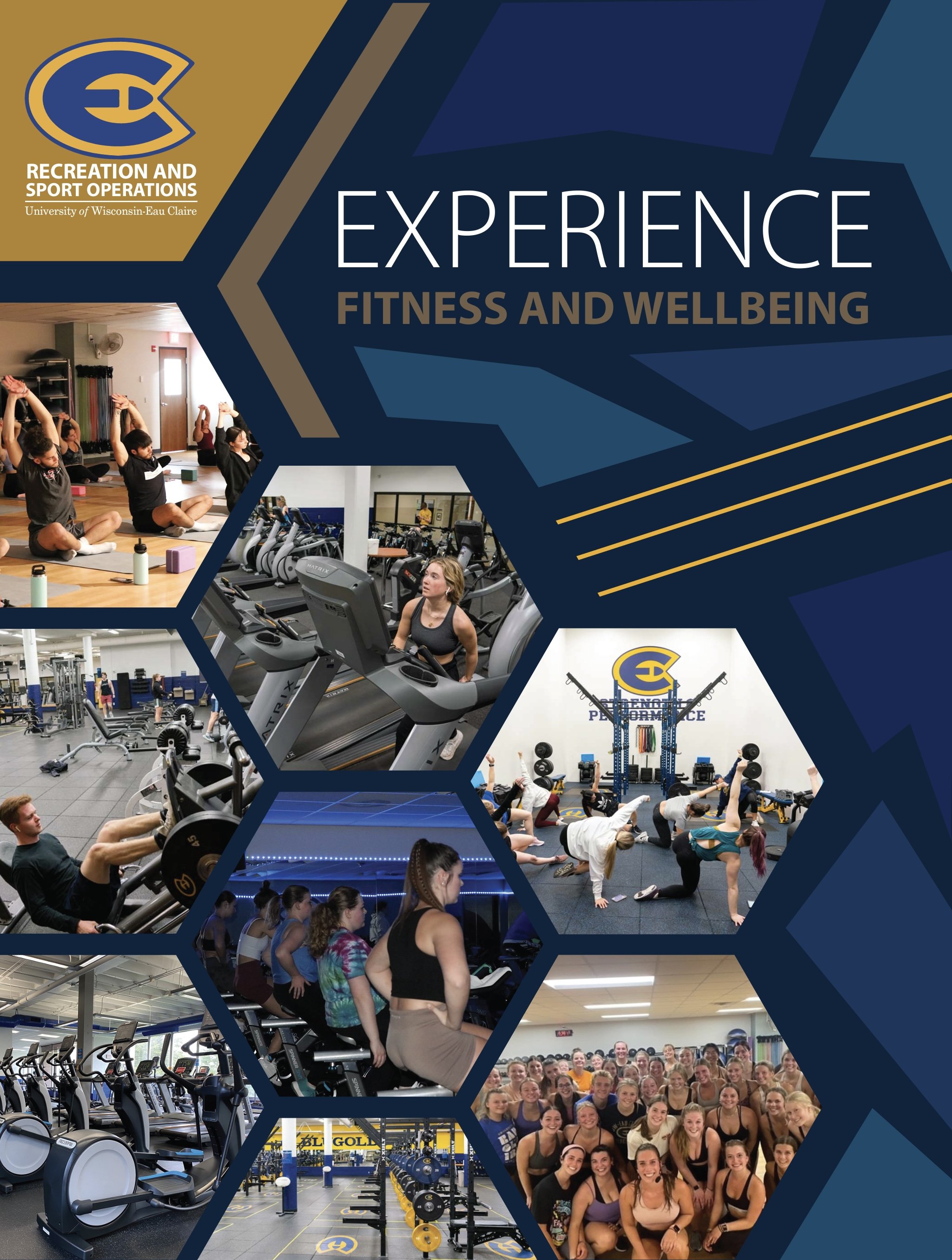
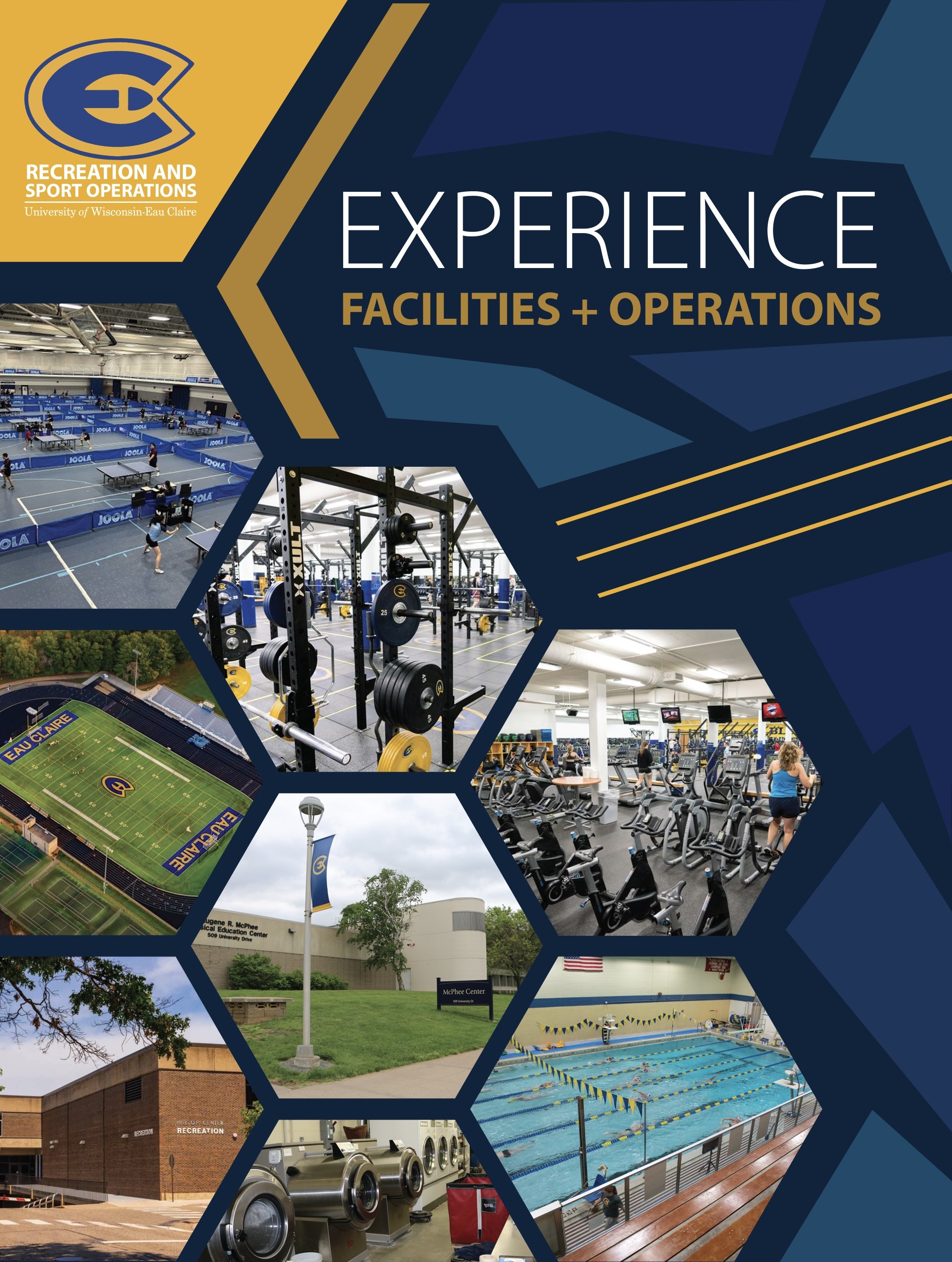
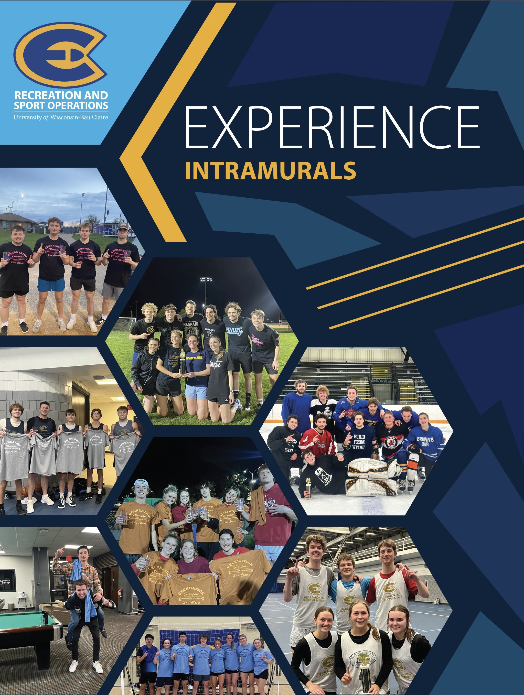
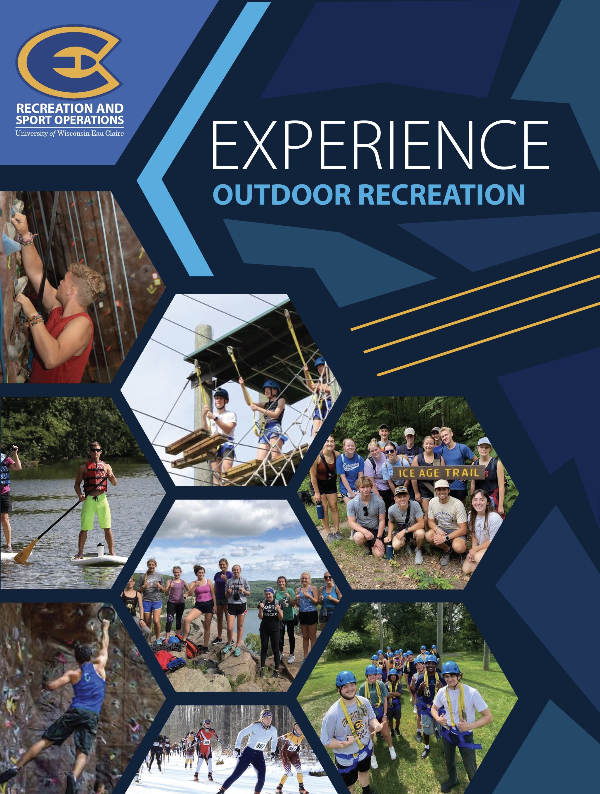
Bold typography and team colors create a strong visual identity, while a clean layout ensures the eye flows through the content. The design balances energy with clarity, capturing the intensity of the sport and building excitement for the championship.
Graphic Design
State Poster for Bay Area Ice Bear Player
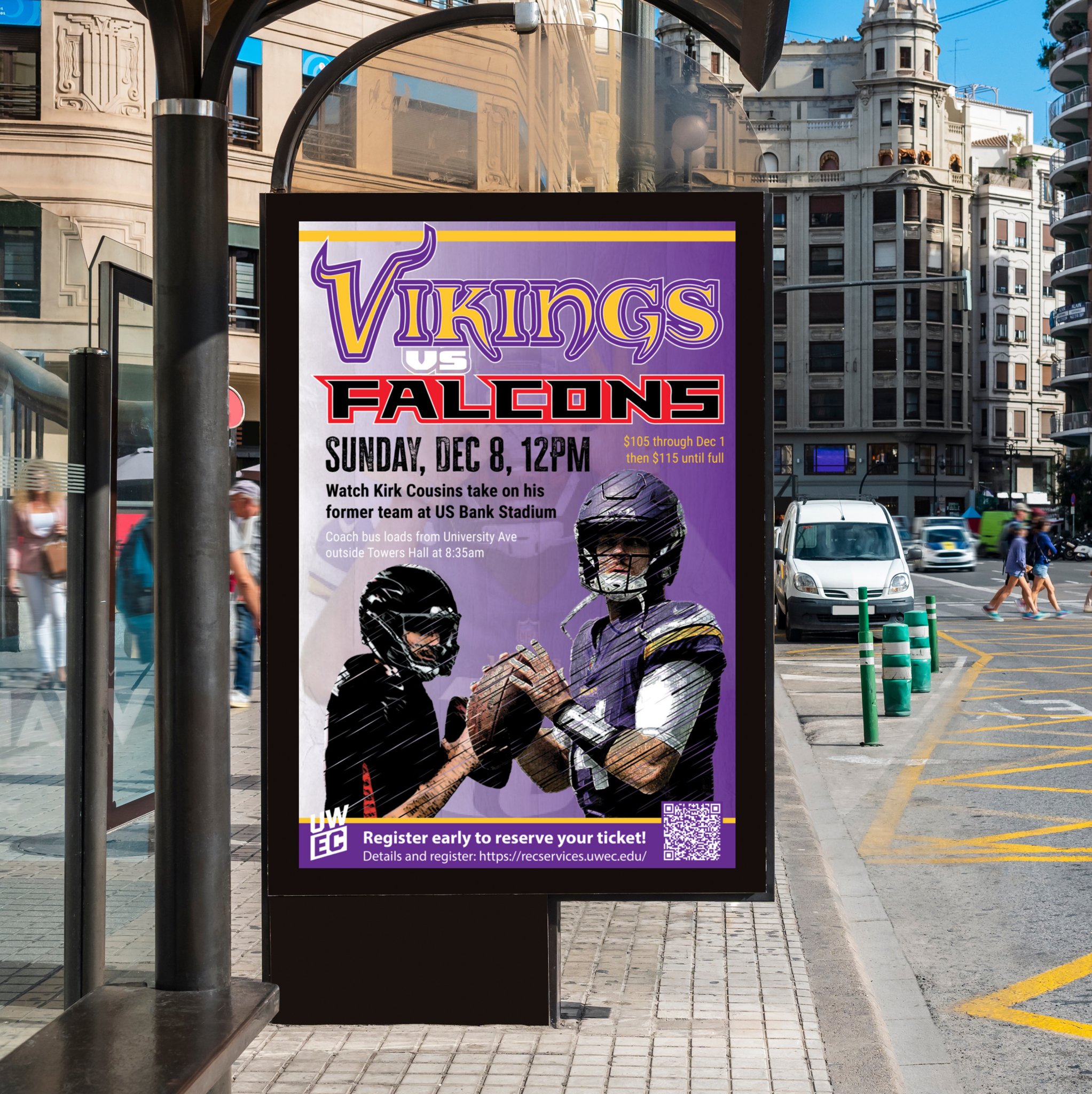
Promotion for UWEC Rec Vikings Bus Trip
The design uses high-impact imagery and layering to engage sports fans. Clear hierarchy ensures essential details, like event date and registration info, are easy to read and accessible. The layout balances visual energy with functional information to drive participation.
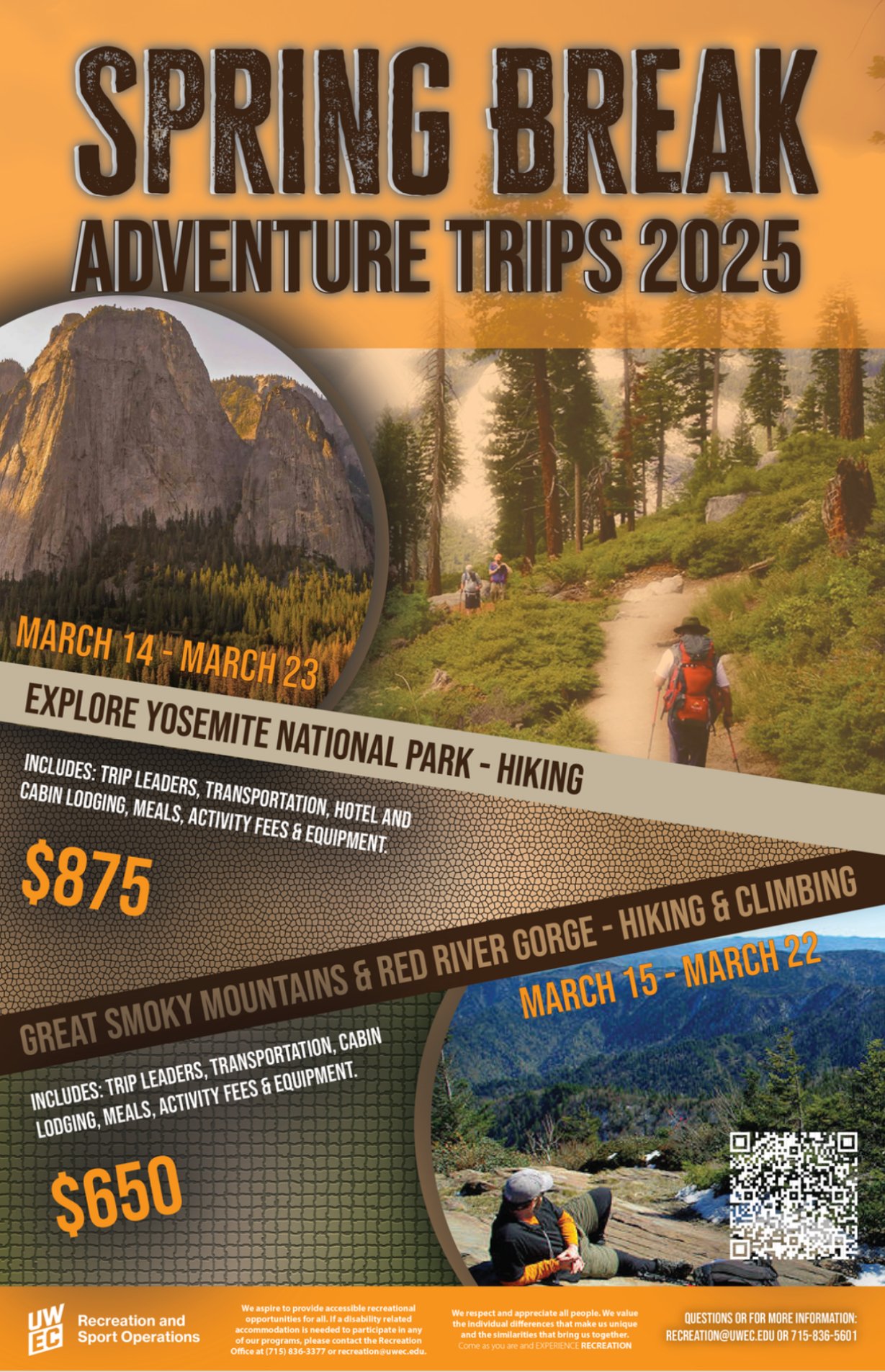
Promotion for EAC Spring Break Trips
The design uses earthy tones and clear messaging to attract nature enthusiasts and students looking for a fun, environmentally conscious break. It aims to communicate both the adventure and sustainability aspects of the program while providing essential details for registration.
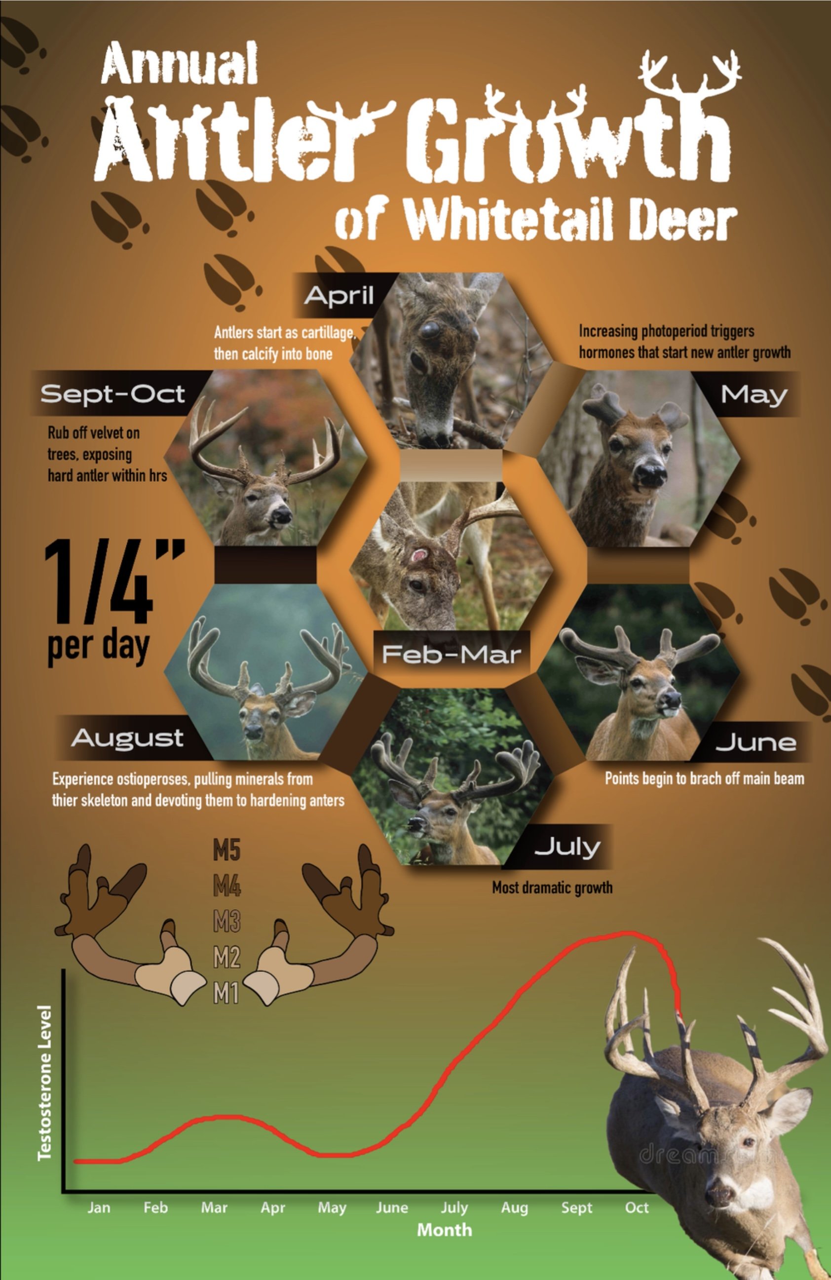
Infographic on the Annual Antler Growth Cycle
The design features two graphs, with detailed graphics showing the progression from velvet-covered antlers to fully mature racks. Key stages such as velvet shedding, hardening, and regrowth are highlighted for easy understanding. The use of color coding enhances readability, providing an informative and engaging way to learn about the process of antler development.
Professional Logos
Complex Designing…
To Simplistic Designing…
Factoring how graphics live on different materials and colors is key in ensuring both legibility and consistent branding.
Developing Rax Brand
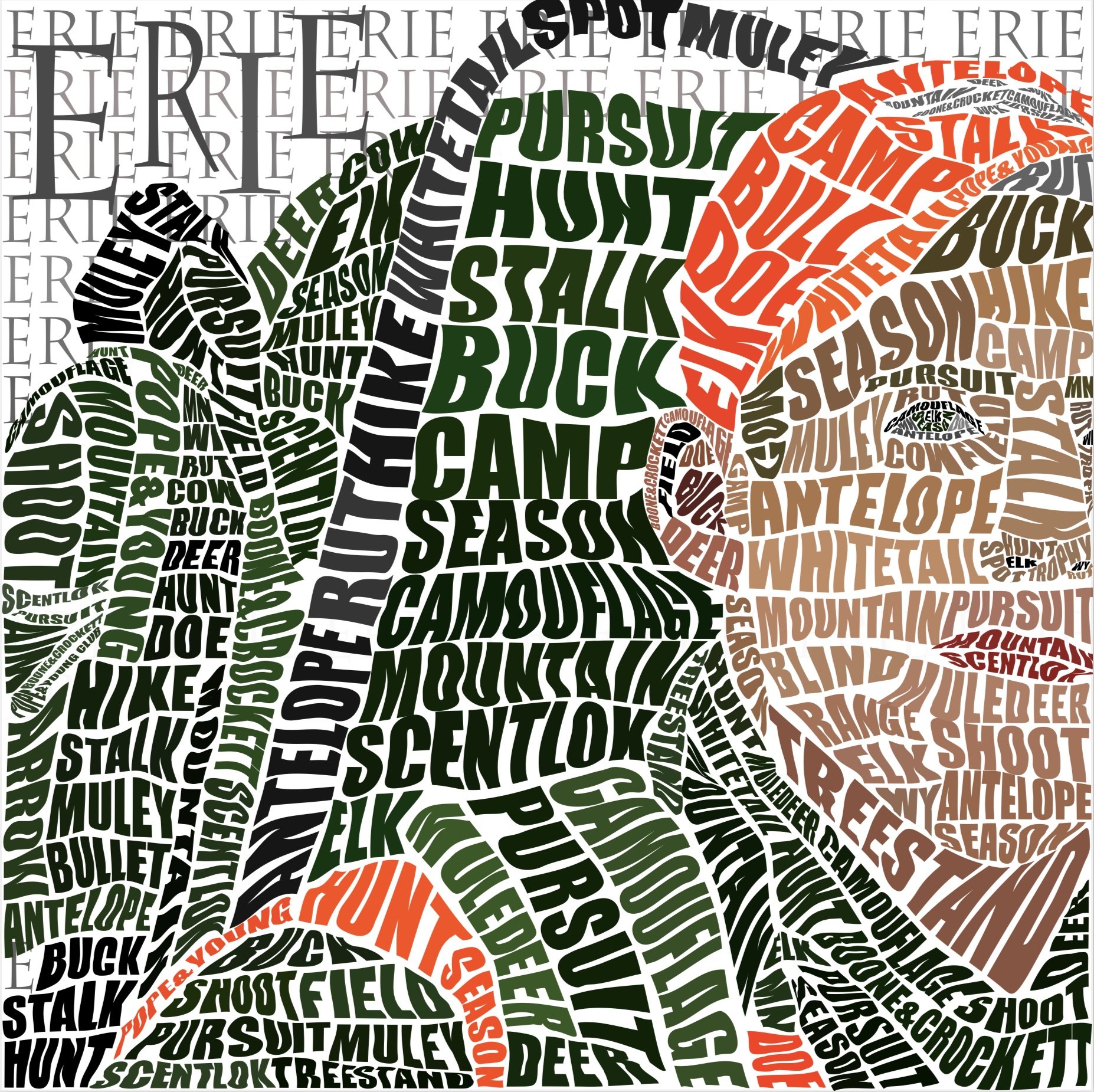
Typography/Word Art expressing my passion…
+
Package Design and Concept Creation…
Designed from front to back…
As the graphic design intern for the University of Wisconsin - Eau Claire Recreation department I was tasked with designing the entire 52 page annual report, this was a very large and rewarding project that took a lot of time and research both in and outside of the office.
Correlating Posters With A Color System…
Another project that I was in charge of during my internship at UWEC was a complete redesign of the 6 Recreation Lounge posters.
These posters are to be displayed next to one another, so the goal was to have the design encourage the eye to flow down the line by casually transforming through the brand colors, while still staying consistent with the layout.


